Fallswell — Branding Case Study
Fallswell is a contemporary water brand built on the idea that wellness should flow as naturally as water itself. The project began as a vision to create a brand that felt clean, confident, and effortlessly modern—something that stood out in a saturated market without relying on clichés of purity or minimalism.
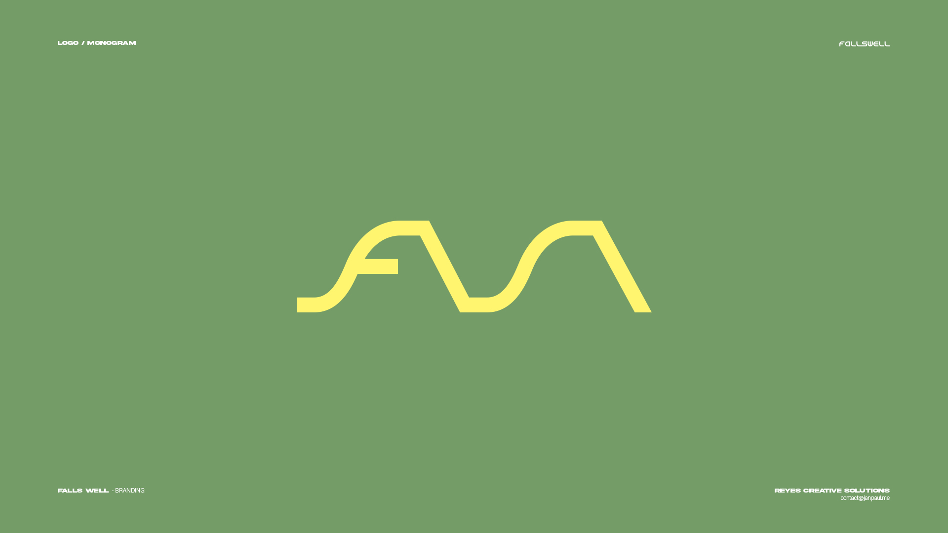
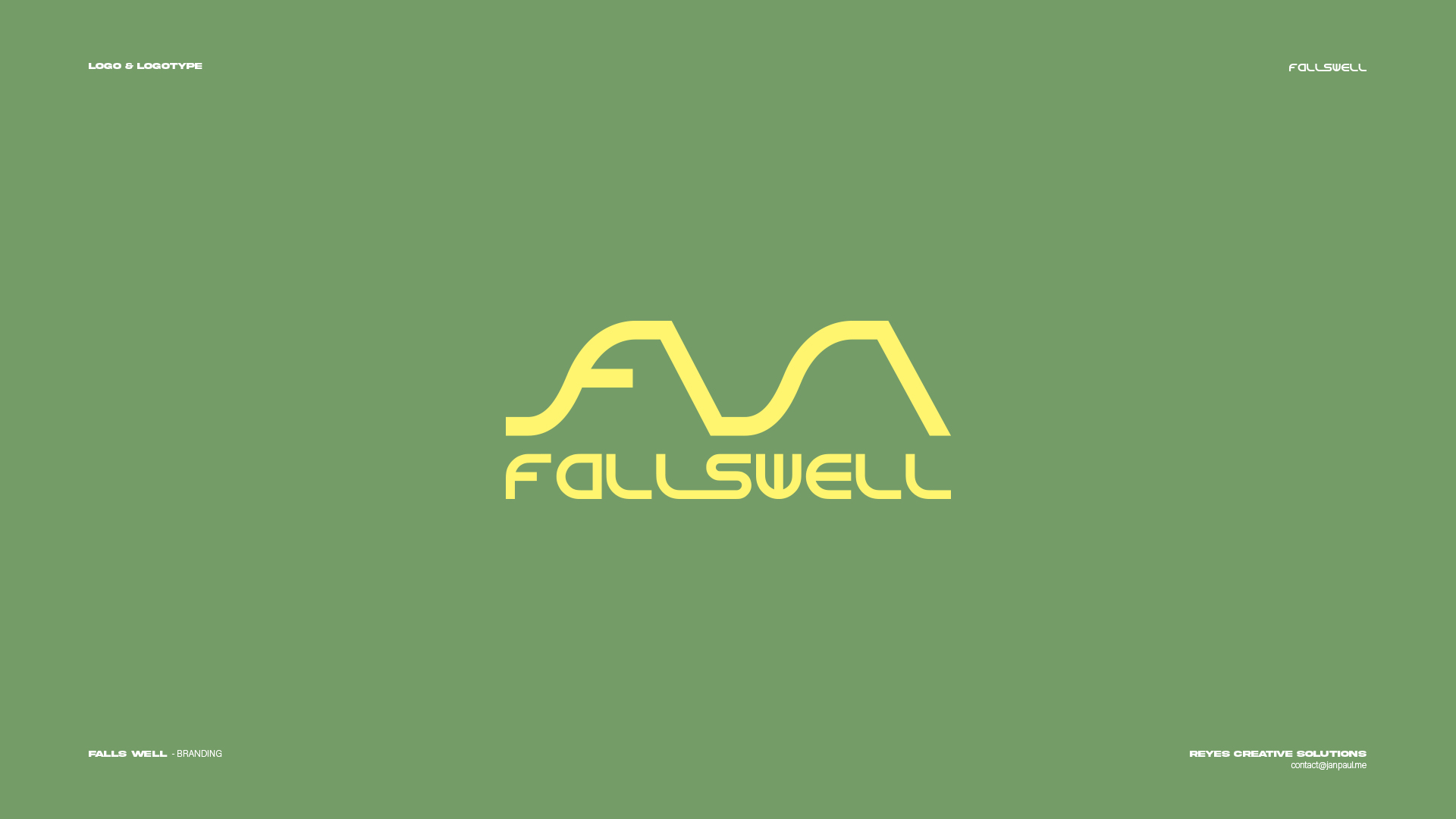
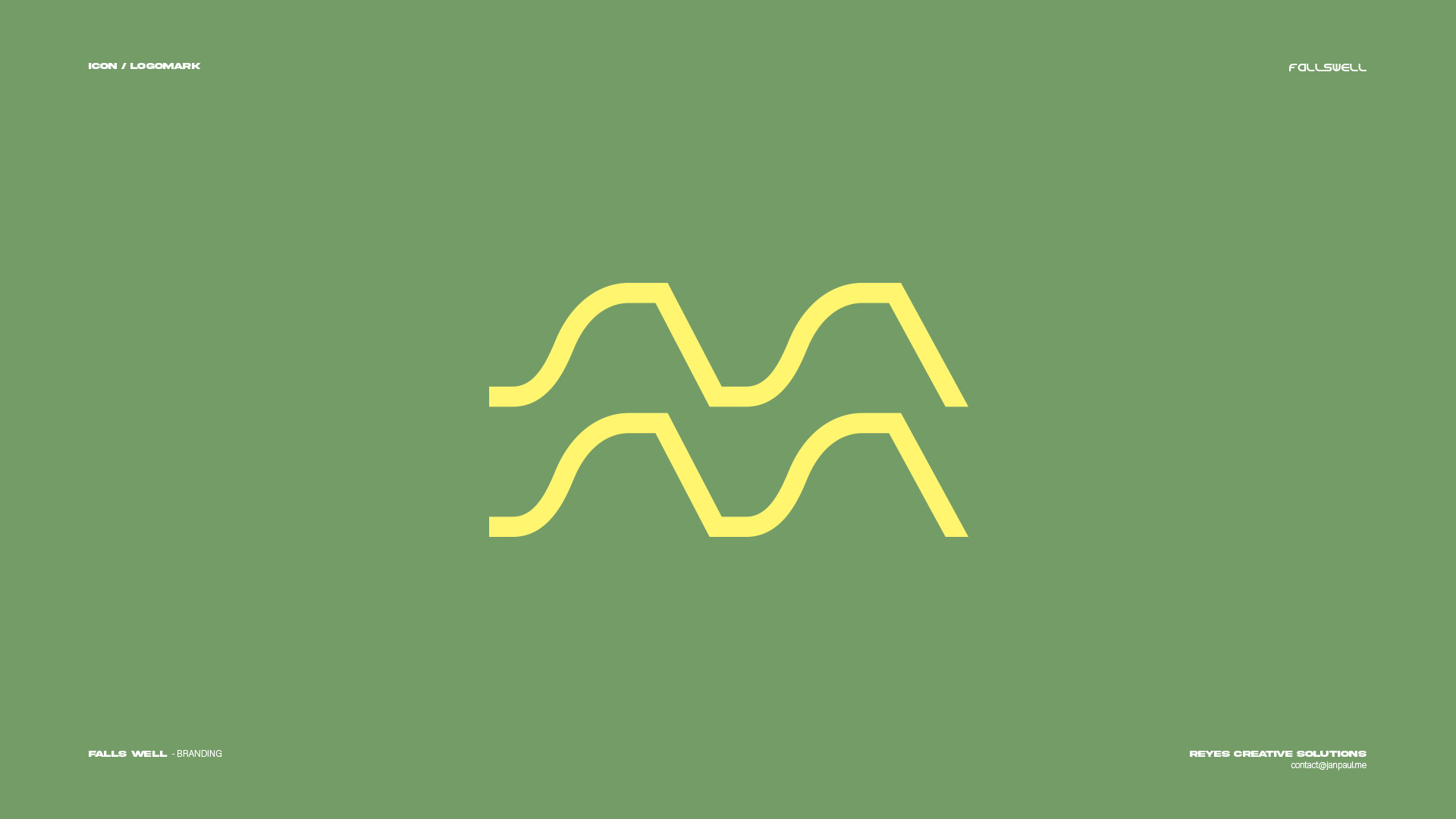
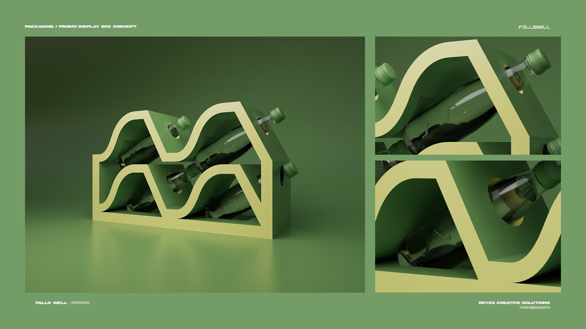
From the very start, my goal was to design a visual identity that moved with rhythm and flow. The logomark takes inspiration from waves and motion—two mirrored curves forming the initials “F” and “A,” while also suggesting the movement of water itself. The balance between symmetry and organic fluidity became the foundation of the brand’s tone: calm, functional, and forward-thinking.
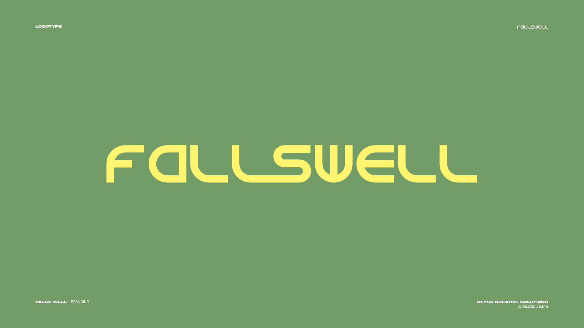
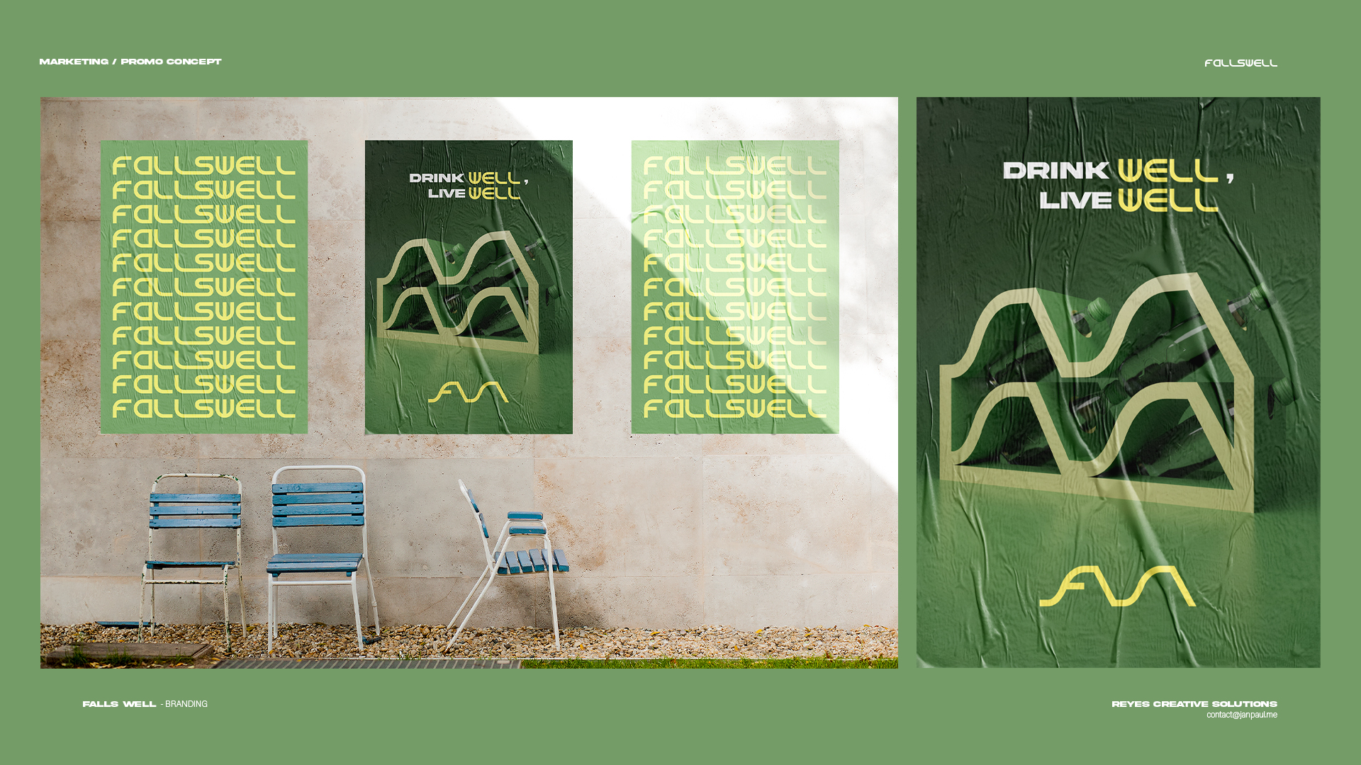
The custom logotype extends that same language. Each letter carries a soft geometric precision, echoing the fluid rhythm of the icon. Together, the system feels futuristic yet grounded—reflecting Fallswell’s mission: Drink Well, Live Well.
The visual world of Fallswell is designed around tonal greens and mellow yellow accents, a palette that evokes freshness, vitality, and sustainability. From the modular bottle carrier inspired by the logo’s structure to the layered poster compositions, every element reinforces the concept of harmony between design and function.
Creating Fallswell was an exploration of how visual identity can make something as simple as water feel sophisticated and aspirational—without losing authenticity. The result is a brand that doesn’t just look refreshing—it feels alive.